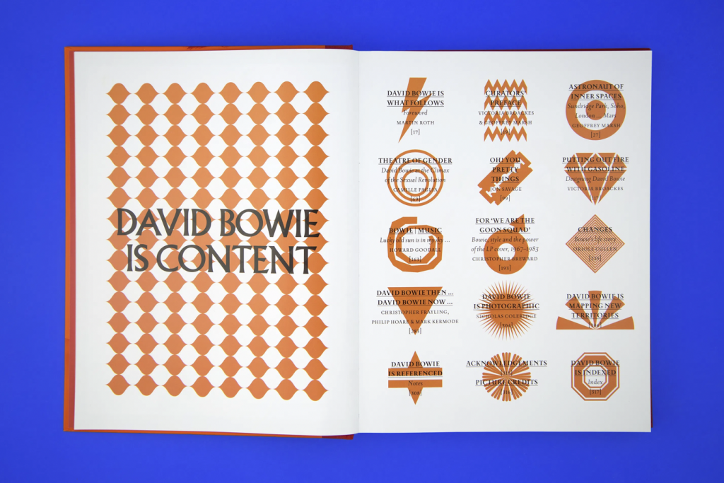


Jonathan Barnbrook’s work has been useful in understanding how graphic design can operate as a tool for political expression, identity construction and symbolic communication. His projects, such as the A Clockwork Orange redesign, the David Bowie Is… exhibition catalogue, and The Shape of Things, show how typography and imagery can carry ideological weight while remaining visually striking and conceptually rigorous. Barnbrook’s ability to embed critique and narrative within highly controlled graphic systems has influenced how I think about the symbolic potential of my own flag work. His approach reinforces that design can confront cultural anxieties and power structures through abstract, symbolic forms, which is something central to my project.